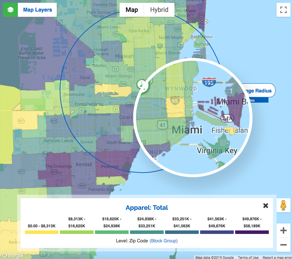
Help them visualize how data variables play out across different geographic areas
If a picture is worth a thousand words, then maps are worth volumes. It's so much easier to convey how data variables play out across geographic areas when you can show them on beautiful, interactive thematic heat maps.
Thematic heat maps help your website visitors understand how data points are dispersed across their region according to geographic boundaries.
The different colors help them see how one area compares to the next for any given variable. Users can click on the color blocks in the map to view numbers.
Thematic heat maps are available on the following reports:
Information displayed in visual ways makes it instantly comprehensible in ways that text and number lists cannot.
Thematic heat maps dramatically improve resonance by making the data meaningful, as well as making it easier to remember.
Users can instantly toggle heat maps between zip code and block group or zoom in and out to see how boundaries are displayed .
Website visitors can easily share the thematic heat maps they build. Choose from email, social media, PDF or custom generated link to bring anyone who clicks back to their chosen map.
ZoomProspector’s beautiful maps offer an inexhaustible source of content for your social media feeds, slide decks, proposals, presentations and trade show collateral.
Our design director, Pau Rodriguez, has developed a color scheme for our heat maps based on an environment for statistical computing and graphics software (R-Project).
"We often see palettes that go from red to green or yellow, which in several countries connotes error, warning or success. GIS Planning data tools need to avoid adding any unwanted connotation to our data visualizations. Consequently, we developed a color scheme to both illustrate objective information and help viewers easily distinguish between data sets."
The strengths of this palette are:
.- Perceptually uniform
.- Avoids most unwanted cultural connotations
.- Accessible for the majority and those with some degree of vision deficiency.
Color blindness affects 4.5% of the population, approximately 1 in 12 men and 1 in 200 women.
Worldwide, there are approximately 300 million people with color blindness. We are breaking the barriers for people managing this condition, providing them with data maps that can be easily viewed and analyzed.
In order to accomodate the three main types of color blindness, we have put together a selection of hues and shades that can address any of the conditions.
GIS Planning is the only economic development solutions provider that offers color blind friendly palettes while being web accessible compliance.
Heat maps will continue to load with the default color scheme we've had in place; if you wish to view the new patterns design for those with color blindness, you can turn on Patterns mode while viewing any heat map, so anyone can visualize and analyze data properly without confusion. The toggle switch is located on the bottom right corner of the legend.
Strategic partnerships with industry leaders offer our clients tremendous advantages
GIS Planning offers a very dynamic tool. It’s a time-saver for us. It allows us to prepare packets in house for prospects those that are visiting the area.
Andy Buffington
Business Marketing and Research Manager